ShadCN UI
Beautiful, copy-paste React components you actually own.
Need an MVP like ShadCN UI?
We'll build it in less than 7 days. Book a free discovery call with Tiny Startup Studio.
Book free discovery call →Quick summary of ShadCN UI
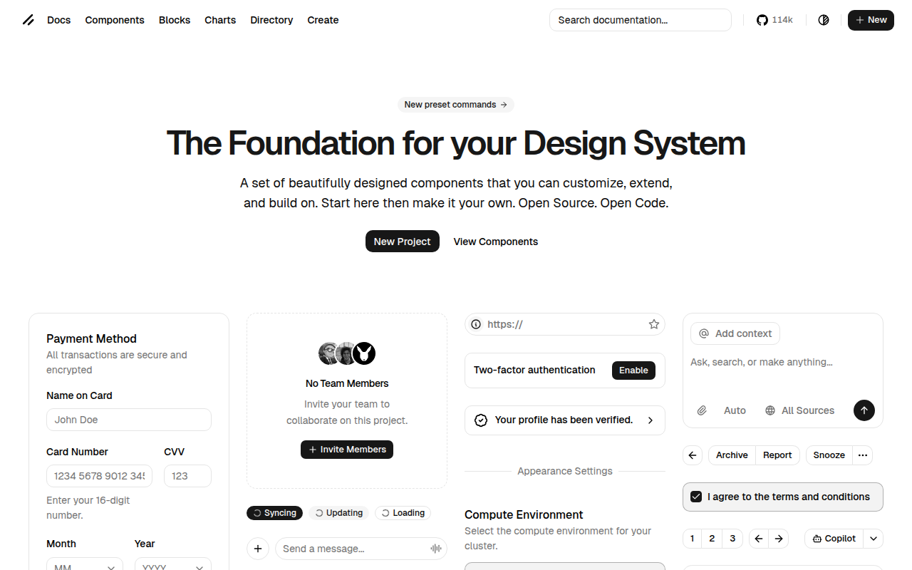
shadcn/ui is the copy-paste React component library created in 2023 by Shadcn (Hunter Heaton) that has fundamentally changed how developers build user interfaces. Open-source MIT licensed with Hunter now working at Vercel on shadcn/ui plus broader v0.dev + Vercel ecosystem. Distinguished from traditional component libraries (Material UI, Ant Design, Chakra UI) by the copy-paste model: components are added via CLI that copies code directly into your codebase, no npm dependency, no version conflicts, full ownership and unlimited customisation. Built on Radix UI primitives (handling accessibility + complex interactions) styled with Tailwind CSS for visual consistency. Core characteristics: copy-paste via `npx shadcn add button` CLI command, full code ownership with no library dependency, Radix UI primitives handling focus management/keyboard navigation/accessibility, Tailwind CSS utility-class styling, minimal monochrome aesthetic matching modern startup look, WCAG-compliant accessibility via Radix, native dark mode via Tailwind + CSS variables, full TypeScript with prop interfaces, theme customisation via globals.css + CSS variables, 40+ components (Button, Card, Dialog, Sheet, Form, Calendar, Table, Combobox, Command, Toast), Charts component added 2024 with Recharts integration, CLI tool for adding/updating/theming, open-source MIT licensed for any use including commercial. Best for building new React web apps (shadcn/ui is the obvious 2026 default), startup MVP UI with beautiful default UI in days vs weeks of custom design, internal tools and admin dashboards using the Tailwind + shadcn pattern, B2B SaaS application UI matching modern aesthetic, marketing site components, custom design system foundation (many teams start with shadcn and evolve), replacing Material UI / Ant Design via gradual migration, learning React + Tailwind via high-quality reference code. Pricing: completely free under MIT license. Direct competitors: Material UI / MUI (legacy package-based, opinionated Material Design), Ant Design (Alibaba's enterprise UI library, package-based), Chakra UI (Tailwind-adjacent but package-based), Mantine (React + Tailwind components), Headless UI (Tailwind Labs' Radix-equivalent primitives), DaisyUI (Tailwind component library, CSS-only), Radix UI directly (the primitives shadcn builds on), Tremor (React dashboard components), Park UI (Ark UI + Panda CSS-based), shadcn-vue/shadcn-svelte (community ports for other frameworks). shadcn/ui wins on copy-paste model and design quality and Radix primitives integration and Vercel ecosystem support; Material UI wins on opinionated complete Material Design; Ant Design wins on enterprise data-heavy components; Mantine wins on more components in traditional package model; Headless UI wins on official Tailwind Labs support.
⏱ 30-second verdict
- Copy-paste model solves package-dependency problems (no version conflicts, full ownership, unlimited customisation)
- Radix primitives + Tailwind = beautiful + accessible + performant; design quality unmatched by Material UI/Ant Design
- Tailwind CSS required (learning curve for traditional CSS); React-only officially (community ports for other frameworks)
About
ShadCN UI provides a collection of beautifully designed, accessible React components built with Radix UI and Tailwind CSS. Unlike traditional component libraries, you copy the source code directly into your project, giving you full control to customize everything without fighting library constraints.
🎯 Why it's useful
Founders can ship polished, professional-looking interfaces fast without hiring a designer, while keeping complete ownership of the code for future customization as their product evolves.
💜 Our take
It's the best of both worlds—you get production-ready components without the dependency headaches. The components look gorgeous out of the box and you're not locked into someone else's design system.
How indie founders use ShadCN UI
Startup MVP UI
Beautiful default UI in days vs weeks of custom design. Standard pattern for React + Next.js startups in 2026.
Internal tools + admin dashboards
Tailwind + shadcn = standard pattern for modern admin UIs. Replaces ugly Bootstrap admin templates.
B2B SaaS application UI
Aesthetic fits modern B2B SaaS look. Beautiful + accessible + customisable for brand differentiation.
Design system foundation
Many teams use shadcn as starting point and evolve into custom design system. Best of both worlds.
shadcn/ui is the copy-paste React component library that has fundamentally changed how developers build user interfaces, created in 2023 by Shadcn (Hunter Heaton) as a personal project that exploded into one of the most influential frontend developments of the past two years. Now powering thousands of production applications and inspiring an entire ecosystem of component libraries, shadcn/ui is unusual in being a 'not really a library' — there's no npm install of components, no version upgrades, no breaking changes from package updates. What makes shadcn/ui revolutionary is the copy-paste model + design quality + Radix primitives underneath. Traditional component libraries (Material UI, Ant Design, Chakra UI) ship as npm packages that you depend on, accept their design opinions, and inherit their bundle size + version constraints. shadcn/ui works differently: you copy individual component code directly into your codebase, customise freely, own it forever. The components are built on Radix UI primitives (which handle complex accessibility + interaction logic) styled with Tailwind CSS, resulting in beautiful + accessible + performant components that you fully own. The core characteristics: • **Copy-paste, not install** — components are added via CLI (`npx shadcn add button`) which copies code into your project • **You own the code** — no library dependency; modify, theme, customise freely • **Built on Radix UI** — complex behaviors (focus management, keyboard nav, accessibility) handled by Radix primitives • **Tailwind CSS styling** — consistent design system through Tailwind utility classes • **Beautiful defaults** — minimal monochrome aesthetic with subtle interactions; matches modern startup aesthetic • **Fully accessible** — WCAG-compliant via Radix; keyboard navigation + screen reader support out of the box • **Dark mode native** — built-in dark mode support via Tailwind + CSS variables • **TypeScript** — fully typed components with proper prop interfaces • **Theme customisation** — `globals.css` + CSS variables for brand colors, fonts, radii • **40+ components** — Button, Card, Dialog, Sheet, Form, Calendar, Table, Combobox, Command, Toast, etc. • **Charts component (recent)** — added 2024 with Recharts integration • **CLI tool** — `npx shadcn` for adding components, updating, theming • **Open-source MIT licensed** — free for any use including commercial For React developers + technical founders the use cases: • **Building a new web app** — start with shadcn/ui instead of fighting with Material UI or building from scratch • **Startup MVP UI** — beautiful default UI in days vs weeks of custom design work • **Internal tools + admin dashboards** — Tailwind + shadcn = standard pattern for modern admin UIs • **B2B SaaS application UI** — the aesthetic fits the modern B2B SaaS look • **Marketing site components** — many use shadcn components in marketing sites too • **Custom design system base** — many teams use shadcn as starting point and evolve into custom design system • **Replacing Material UI / Ant Design** — migrate away from package-based libraries to copy-paste model • **Learning React + Tailwind** — shadcn code is high-quality reference implementation The pricing is simple: free. shadcn/ui is open-source MIT licensed. No paid tier, no premium components, no subscription. The Shadcn (Hunter Heaton) maintains it as primary maintainer alongside Vercel's developer relations team. Vercel has hired Shadcn to work on the project as well as the broader v0.dev + Vercel ecosystem. The model: free open-source as a strategic investment in Vercel/Next.js developer ecosystem. Where shadcn/ui wins clearly: the copy-paste model genuinely solves problems traditional libraries can't (no version conflicts, full ownership, unlimited customisation); the design quality is exceptional — components look better than 90% of custom-designed UIs; the Radix primitives underneath mean accessibility + complex interactions just work; the Tailwind integration aligns with the modern frontend stack; the open-source MIT license + Vercel backing means it's sustainable; the ecosystem has exploded (shadcn-themed templates, charts library, blocks, third-party component additions). Where it loses: requires Tailwind CSS comfort (steep learning curve for traditional CSS users); React-only (no Vue, Svelte, Angular versions — though community ports exist); the copy-paste model means you don't get automatic security/bug fixes (you manually re-copy updated component code); the consistent aesthetic means projects using shadcn can feel similar (the 'shadcn look' is recognisable now). My take: for any new React project in 2026, shadcn/ui is the obvious starting point — there's almost no defensible reason to start with Material UI or Ant Design for new React applications. The copy-paste model genuinely produces better long-term outcomes than package dependencies. For existing projects on legacy component libraries (Material UI, Ant Design), gradual migration to shadcn is a real productivity investment. For non-React projects, use the community ports (Vue equivalents like shadcn-vue, Svelte equivalents) which capture most of the value. The shadcn pattern (Radix primitives + Tailwind styling + copy-paste) is increasingly the dominant pattern in modern frontend — even if you don't use shadcn directly, the pattern is worth understanding and adopting.
Pricing
Open Source
- ✓Full component library
- ✓Copy-paste model — you own the code
- ✓Commercial use allowed
- ✓No premium tier exists
Free · Open source
Frequently asked questions
shadcn/ui vs Material UI / Ant Design?
Traditional component libraries (MUI, Ant Design) install as npm packages with version constraints + opinionated design + bundle size impact. shadcn/ui is copy-paste — you own the code, customise freely, no version conflicts. For new React projects in 2026, shadcn/ui is the better default. For existing projects on MUI/Ant Design, migration is real work but worth considering at major refactor moments.
Is shadcn/ui really free?
Yes — open-source MIT licensed, free for any use including commercial. No premium tier. Shadcn (Hunter Heaton) maintains it backed by Vercel (which has hired him). Sustainable as part of Vercel's investment in Next.js developer ecosystem.
Do I need Tailwind to use shadcn/ui?
Yes — shadcn/ui is built on Tailwind CSS for styling. Components use Tailwind utility classes directly. If you're not on Tailwind, this is a steep learning curve. For new projects, just adopt Tailwind + shadcn/ui together — they're the modern frontend stack. For existing CSS-modules/styled-components projects, migration is meaningful work.
How does shadcn/ui handle updates?
Manual — when a component updates upstream, you can re-run the CLI to get the new version, which overwrites your copied code (losing your customisations) or you manually merge changes. This is the trade-off of the copy-paste model: full ownership + zero version conflicts vs no automatic updates. Most teams accept this as worth it.
shadcn/ui for Vue / Svelte / Angular?
Officially React-only. Community ports exist: shadcn-vue (Vue 3), shadcn-svelte (Svelte 5), various Angular adaptations. Quality varies but the popular ones are well-maintained. For non-React projects, evaluate the community port for your framework — the shadcn pattern (Radix-equivalent primitives + Tailwind + copy-paste) is increasingly framework-agnostic.
Reviews
No reviews yet — be the first.
Tools like ShadCN UI
See all Design →Figma
The browser-based design tool everyone uses.
Webflow
No-code site builder that produces real CSS.
Yellow Images
The Largest Collection of PSD Mockups on the Internet!
Wise
The design system of Wise.
Who Can Use
A tool to show how color contrast can affect different people with visual impairments.
Websitevice
Website design examples for inspiration that get results instead of awards